


Department of Energy (DOE)
Responsive redesign of the Energy.gov website’s information architecture and visual elements and layout.
Project Overview:
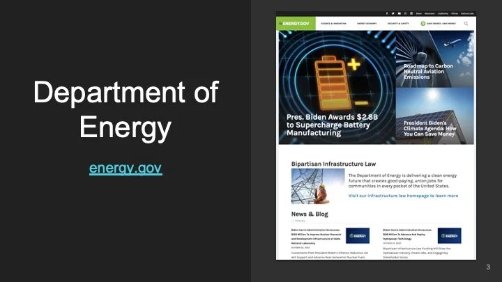
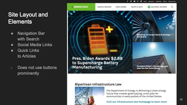
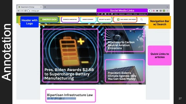
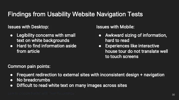
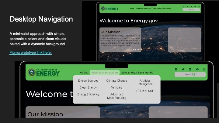
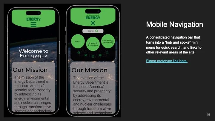
The Problem: The Department of Energy (DOE) website is a valuable resource for information about energy policy, research, and programs. However, the website can be difficult to use. The navigation is cluttered and especially difficult to navigate on mobile, and there are many visual accessibility conflicts with text, color, and images. As a result, users often have difficulty finding the information they need.
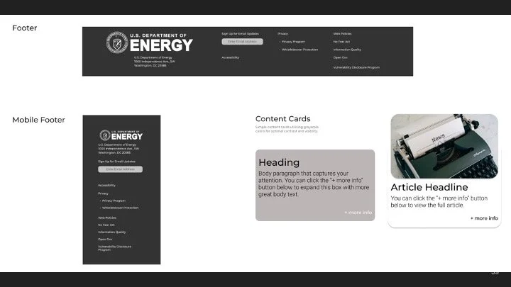
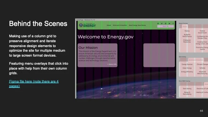
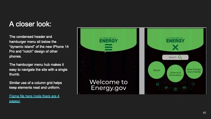
The Solution: I attempted a responsive redesign of the website for mobile and desktop to resolve these issues, which involved a complete overhaul of the site’s information architecture and visual design.
Role & Responsibilities + Team Size:
Lead UX/UI Designer, Individual Project
Project Timeline:
2 Weeks
Deliverables:
High-fidelity desktop and mobile website prototypes and documentation of the design process.
Tools Used:
Figma, Google Drive, InVision, Zoom, Otter AI
Process and
UX Frameworks:
-
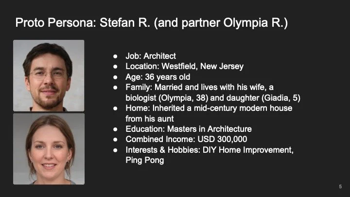
Proto Persona
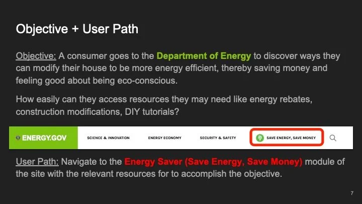
User Path
-
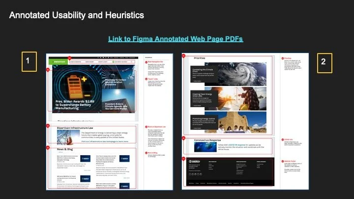
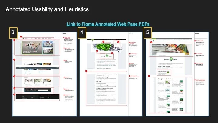
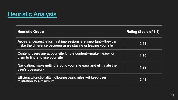
Heuristic Evaluation
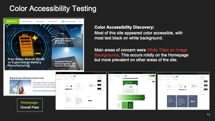
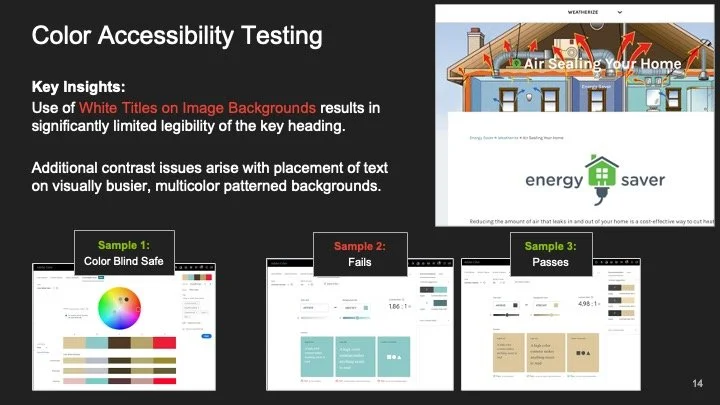
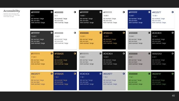
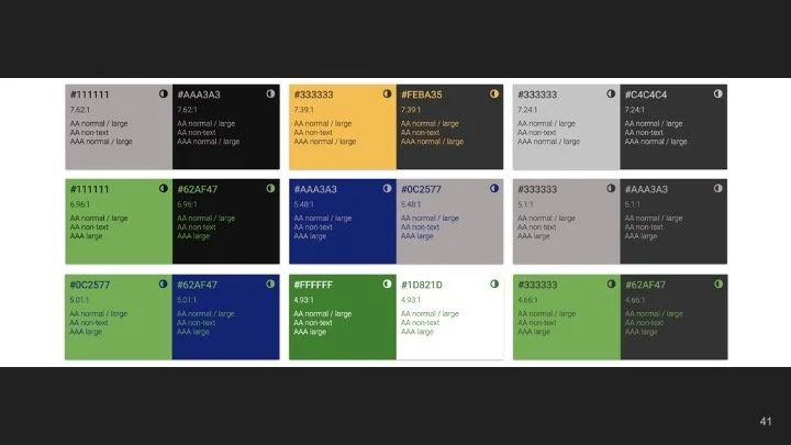
Color Accessibility
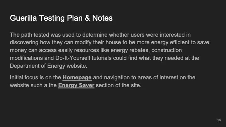
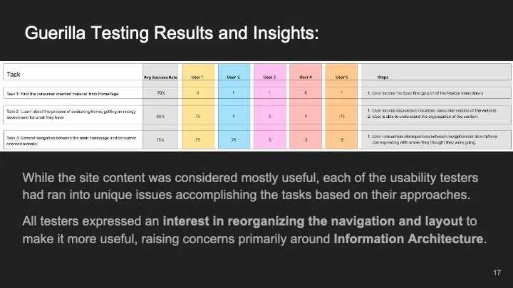
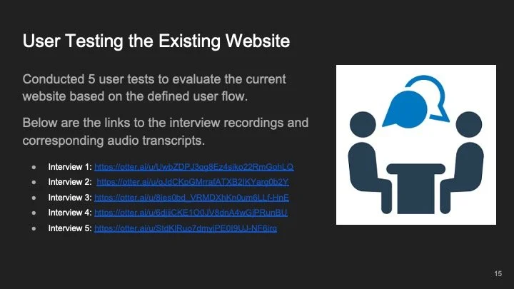
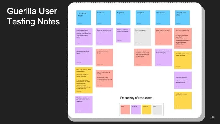
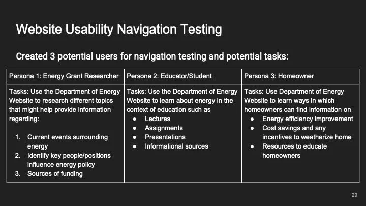
Guerilla User Testing
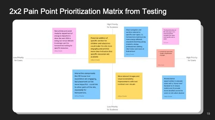
User Pain Points
-
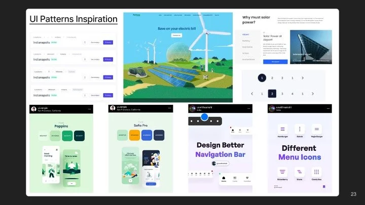
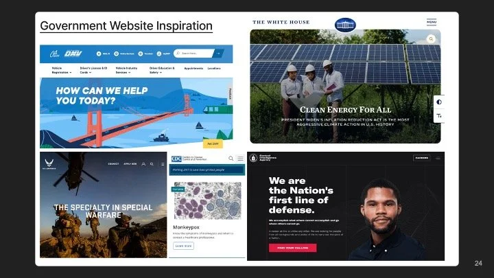
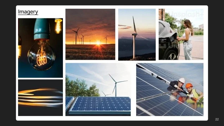
Mood Board
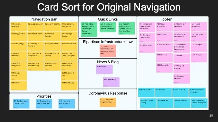
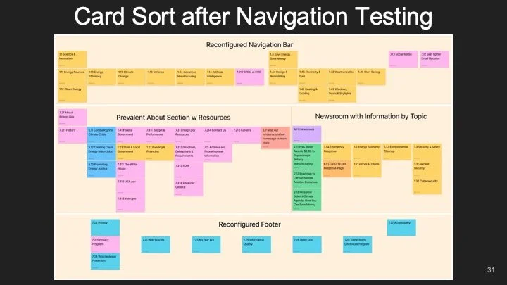
Card Sorting
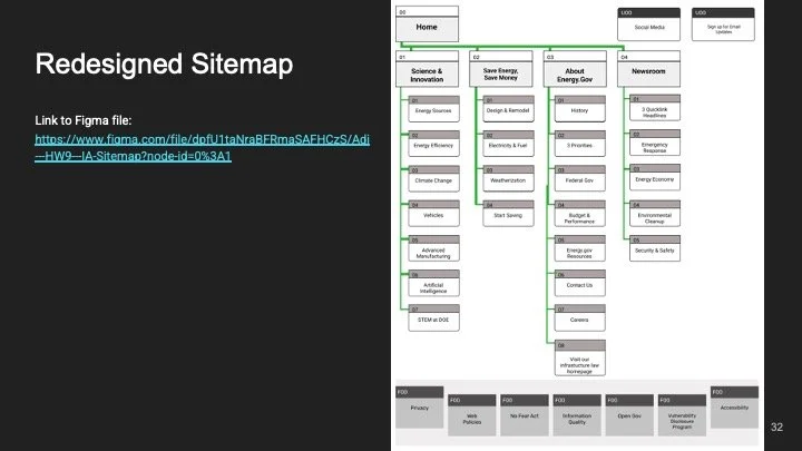
Sitemap
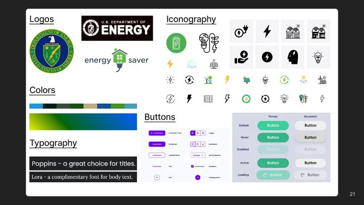
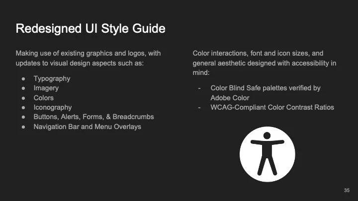
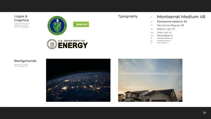
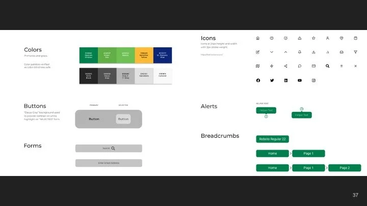
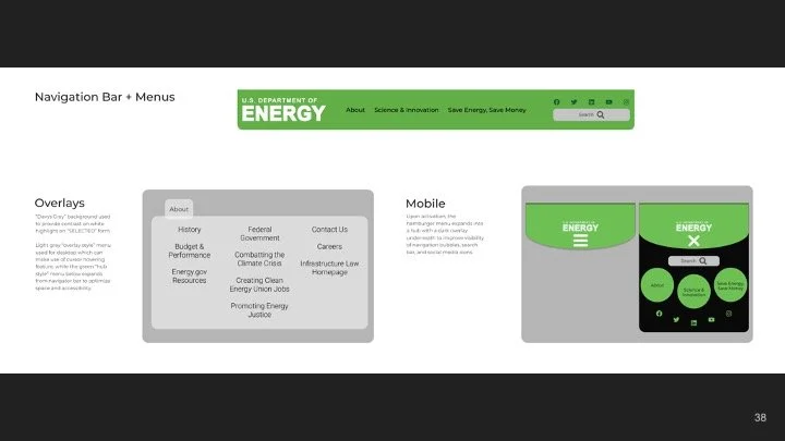
Style Guide
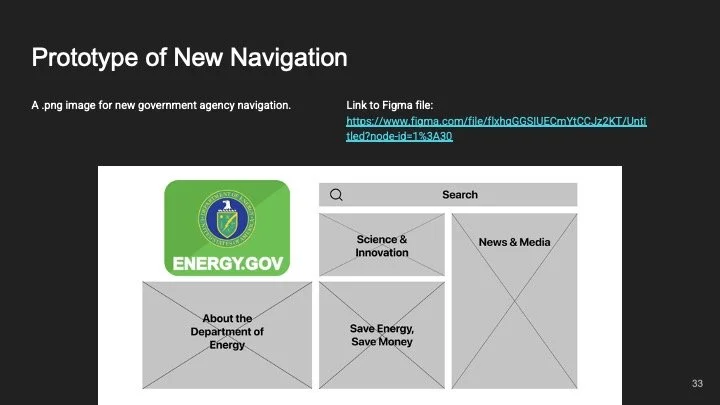
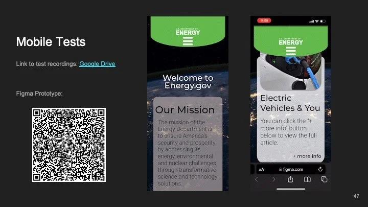
Prototyping
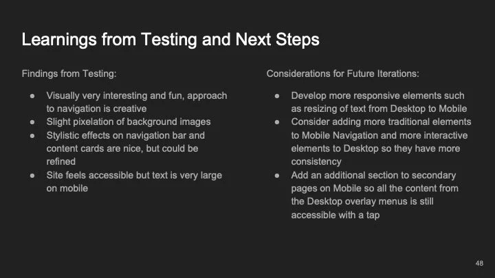
Testing
Read through the original slide deck below,
or click here to open as a PDF in a new tab.


Thank you for reading this case study.
I would love to hear your thoughts, questions, and feedback.
Connect with me on LinkedIn or
email me at contact@adichawla.com