B2C TRAVEL APP
Personalized concierge experience in your pocket
ROLE
Designer
EXPERTISE
UX & UI
Year
2022
TIMELINE
2 Weeks


Project Description
The goal was to streamline scheduling tasks for individuals and businesses alike, leveraging artificial intelligence to optimize time management and productivity.
Challenge
When traveling, people often struggle to discover meaningful, flexible activities that match their interests. Many tools are rigid, require upfront commitments, or don’t feel tailored to the traveler’s context.
Approach
Using the design‑thinking process, I started with direct user research to identify core needs of global travelers to hone in on specific common needs.
Research & Planning
Conducted 5 user interviews → affinity map → empathy map → persona → “How Might We” statement.
User interview questions were informed by competitive analysis and uncovered insights ranging from:
Planning trips
Reasons for travel
Prior travel experience
Sociability
Interests and activities and how they factor into travel planning
Attitude towards travel today (perspective changes after COVID)
How might we provide travelers with a planning tool that offers flexibility and targeted discovery?
In addition to a detailled competitive analysis, I felt it was important to narrow down on specific needs expressed by travelers.
I syntehsized my UX research into a few artifacts including an “I Like / I Wish / I Want”, a feature‑prioritization matrix, and a value‑proposition matrix to hone in on a realistic scope of work given my constraints as a solo designer attempting to arrive at a solution within 2 weeks.
Ideation
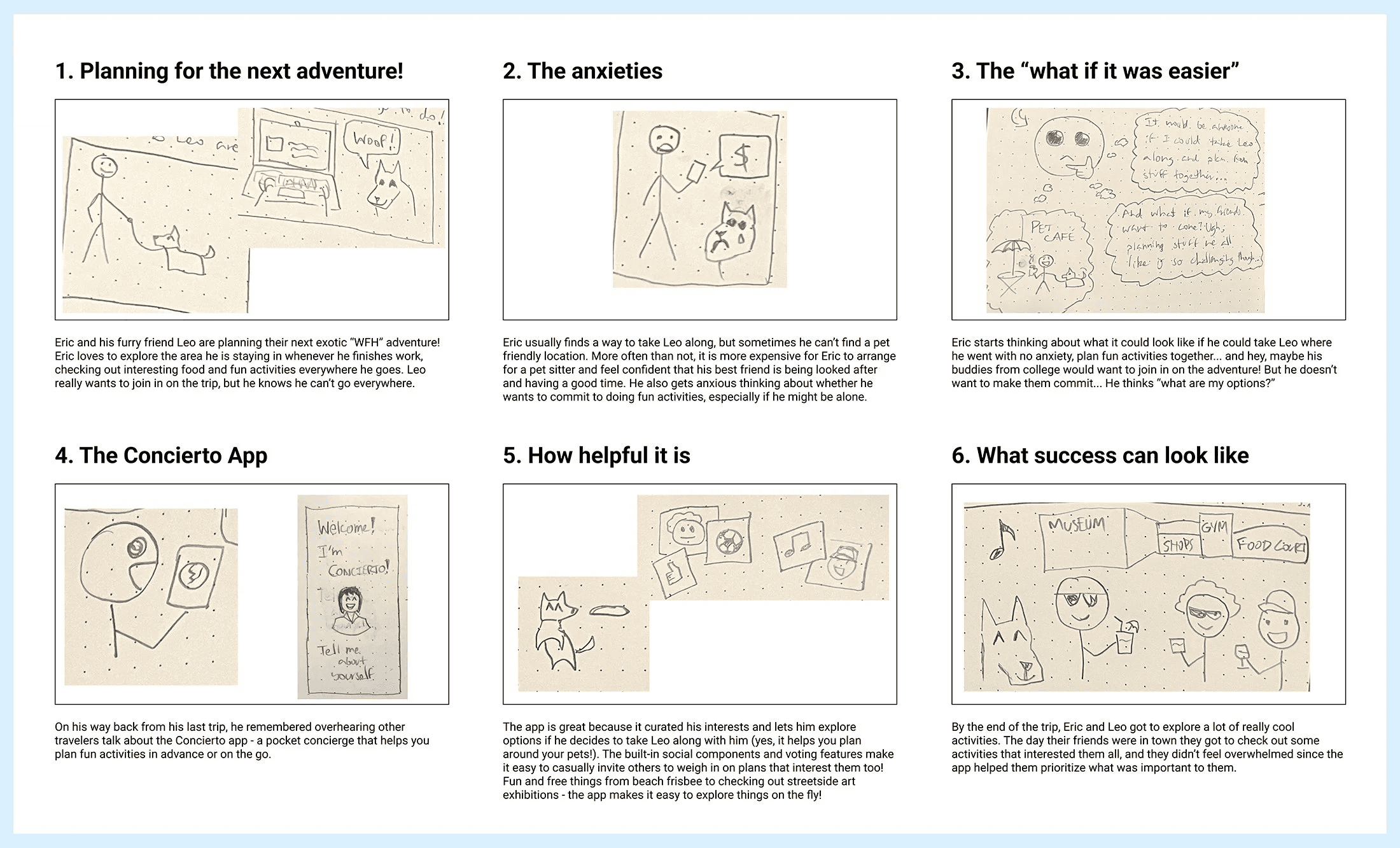
Created a comic sketch of a traveler with a pet often faced with the challenge of finding pet-friendly accommodations and activities to set the scene for the app as a potential solution to their problems.

From here, I segmented the narrative into distinct phases of a more typical user journey that travelers with pets might experience.
Early Prototyping
I was able to distill a core onboarding experience which I sketched out and then created a lo-fi prototype for in InVision. After 10 user tests, I had enough feedback to improve upon the design such as including progress indicators in my Figma wireframes as I began to build out the visual brand for the app experience


Brand Design
The visual design experience drew inspiration from how luxury experiences presented by hotel concierges and travel planning professionals always had a personal touch with engaging yet concise conversational styles.

User Testing & Iteration
Ran 7 additional tests; insights surfaced such as the need for a visible onboarding progress indicator and the desire to delay mandatory account creation to reduce friction.
Fast-Forward 3 Years
In the process of updating my portfolio I've reflected on my growth as a designer and took the opportunity to revamp this case study by refreshing the original iOS 16 app design using the latest design elements of Liquid Glass in iOS 26.
Visual Design
Using the design‑thinking process, I started with direct user research to identify core needs of global travelers to hone in on specific common needs.
Logo
I started with an illustration of a concierge, a familiar site at hotels often associated with providing the highest quality of service.
I experimented with layering different glass frames in Figma, to arrive at the perfect face (or lack-there-of) for a minimal take on a universal symbol.

Colors
In the process of logo ideation I selected four variations of purple and two gold accents. I built on these colors by adding vibrants variants of green, orange, and magenta.

Typography
Urbanist is a dynamic and sans serif font with variable weights - an excellent candidate for modern, luxurious interfaces.

Icons
The visual design experience drew inspiration from how luxury experiences presented by hotel concierges and travel planning professionals always had a personal touch with engaging yet concise conversational styles.

Glassmorphism
Creative exploration of the glass effect in Figma to explore how it might interact with the different colors, shapes, and text elements.


Solution
Concierto delivers a clean, minimalist iOS experience - and design elements refreshed for Liquid Glass.
Personified Interface
Visually humanized brand with a concierge avatar and bold blue/gold color scheme to evoke trust and discovery.
Simple Onboarding
Streamlined onboarding, focused on meaningfully collecting relevant information for an optimal user experience - further enhanced by a minimalist progress indicator.
Additional Personalization
Curated feed of events and activities, personalized by interests and location (with options for additional platform integrations).


